Flu Prediction
In this tutorial, we will analyze the evolution of the flu in France over 4 years. The data is produced by OpenHealth (download csv).
First, we will explore the data, which is a time series. Then, we will study the periodicity of flu episodes. To finish, we will predict the tendency of the flu over a year.
Imports
import pandas as pd
import numpy as np
import matplotlib.pyplot as plt
from pandas.plotting import register_matplotlib_converters
register_matplotlib_converters()
Data cleaning
We load and prepare the data. We replace the values 0 by the mean of the previous value and the following one.
df = pd.read_csv("data/OpenhealthS-Grippal.csv", sep=";")

# Clean data and change data types
df = df.drop(["IAS_lisse", "Incidence_Sentinelles"], axis=1)
df.rename(columns={'PERIODE': 'period'}, inplace=True)
df['period'] = pd.to_datetime(df['period'])
df['IAS_brut'] = pd.to_numeric(df['IAS_brut'].str.replace(",", "."), errors="coerce")

# Replace 0 values by Nan and interpolate them
df["IAS_brut"].replace(0, np.nan, inplace=True)
df["IAS_brut"] = df["IAS_brut"].interpolate(method='linear')

# Display dates
print("Start date:", df["period"].min())
print("End date:", df["period"].max())
df.head()
Start date: 2009-07-01 00:00:00
End date: 2014-04-17 00:00:00
| period | IAS_brut | |
|---|---|---|
| 0 | 2009-07-01 | 1.7 |
| 1 | 2009-07-02 | 3.4 |
| 2 | 2009-07-03 | 2.1 |
| 3 | 2009-07-04 | 1.3 |
| 4 | 2009-07-05 | 14.2 |
Data exploration
We display the time serie:
plt.figure(figsize=(20,10))
plt.plot(df["period"], df["IAS_brut"])
plt.grid()
plt.title("Number of cases of influenza")
plt.show()
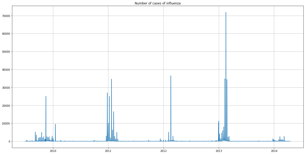
The graph represents the number of cases of influenza detected per day, over 4 years.
There was a strong peak in the beginning of 2013. It appears in the press that this was the longest epidemic for 30 years.
It seems that there were few cases in 2014, but this is explained by the fact that the data stopped in April 2014.
plt.figure(figsize=(20,10))
plt.hist(df["IAS_brut"], 100)
plt.grid()
plt.title("Histogram of marginal law")
plt.show()
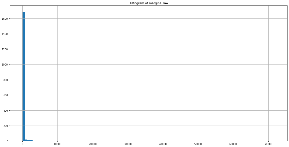
The histogram shows that most of the days, there are few cases of influenza.
In order to better visualize the variations, we will apply the natural logarithm to the data.
df["IAS_brut"] = np.log(df["IAS_brut"])

plt.figure(figsize=(20,10))
plt.plot(df["period"], df["IAS_brut"])
plt.grid()
plt.title("Number of cases of influenza")
plt.show()

plt.figure(figsize=(20,10))
plt.hist(df["IAS_brut"], 100)
plt.grid()
plt.title("Histogram of marginal law")
plt.show()
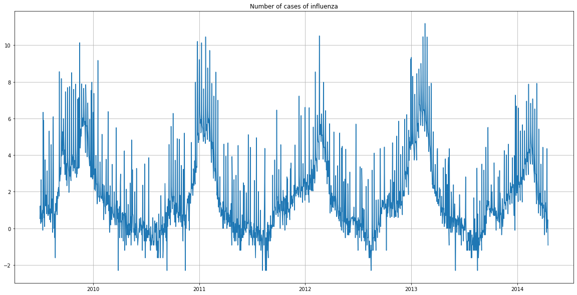
We now notice that the number of cases of influenza is cyclical. It follows a similar pattern from year to year.
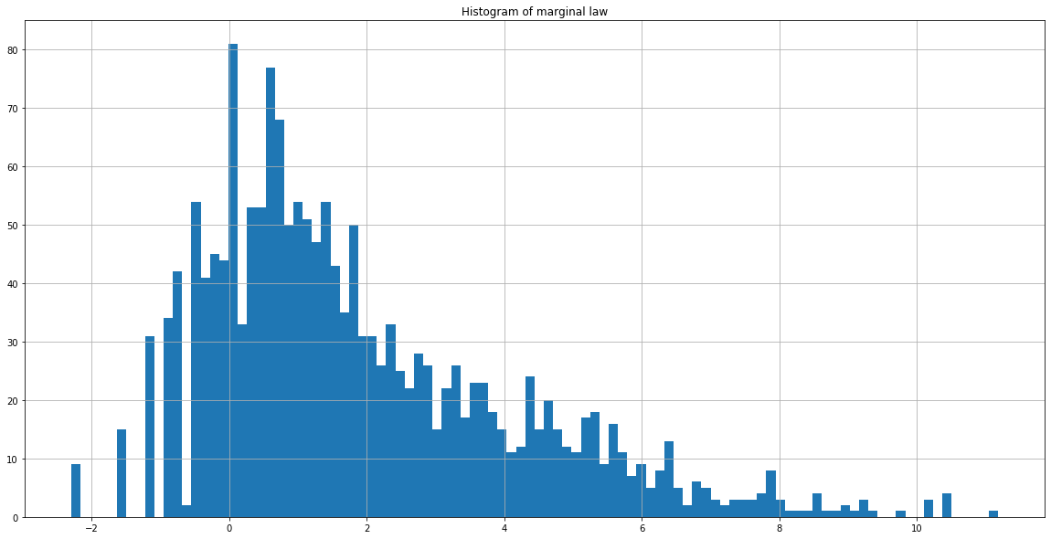
The histogram is now more extensive. Transformation by the natural logarithm smoothed the data and made it more readable.
Analysis of the flu cycles
To analyze the periodicity of the flu episodes, we will display a periodogram, which estimates the power spectral density of a signal by taking the square of its Fourier transform.
from scipy import signal

plt.figure(figsize=(20,8))
f, Pxx_den = signal.periodogram(df["IAS_brut"])
plt.semilogy(f, Pxx_den)
plt.title("Périodogram")
plt.ylim([1e-3, 1e4])
plt.xticks(np.arange(0,0.55,0.05))
plt.grid()
plt.show()
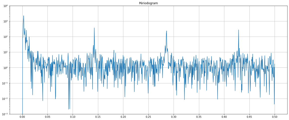
The periodogram shows at which frequencies appear peaks of flu cases. We notice 4 main peaks (around 0, 0.14, 0.28, 0.43).
We compute the exact frequency (in days) corresponding to the peaks:
a = [np.argmax(Pxx_den)]
max_indexes = np.argpartition(Pxx_den, -10)[-10:]
b = np.extract(f[max_indexes] > 0.05, max_indexes)
index = sorted(np.concatenate((a,b)))
1/f[index]
array([350.4 , 7.008 , 3.49700599, 2.33288948])
We note that the number of flu cases is mainly cyclical every year (first peak: 350 days).
We also note a cycle every week (second peak: 7 days). The frequency of the week may be explained by the facts that the patients certainly visit the doctor more on certain days of the week than others (on Monday rather than weekends for instance).
Remove a periodic trend
In order to better study some variations, we can remove periodic trends. Here, we will remove the one-year periodic trend from the data. By doing this, we will loose the data of the first year.
df2 = df.copy()
df2["IAS_brut_diff_period"] = df2["IAS_brut"].diff(periods=365)
df2 = df2.dropna()
df2.head()

plt.figure(figsize=(20,8))
f, Pxx_den = signal.periodogram(df2["IAS_brut_diff_period"])
plt.semilogy(f, Pxx_den)
plt.title("Périodogramme")
plt.ylim([1e-3, 1e3])
plt.xticks(np.arange(0,0.55,0.05))
plt.grid()
plt.show()
| period | IAS_brut | IAS_brut_diff_period | |
|---|---|---|---|
| 365 | 2010-07-01 | 0.000000 | -0.530628 |
| 366 | 2010-07-02 | -0.105361 | -1.329136 |
| 367 | 2010-07-03 | -0.693147 | -1.435085 |
| 368 | 2010-07-04 | 0.182322 | -0.080043 |
| 369 | 2010-07-05 | -0.510826 | -3.164068 |
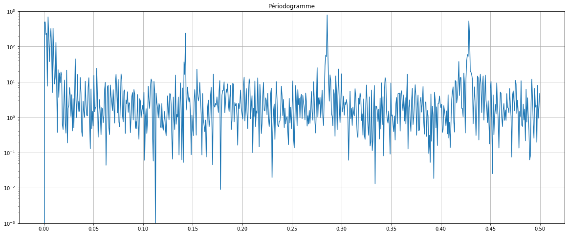
By removing the annual trend the first peak is now reduced and become as important as the others. We will set back this frequency for the rest of the tutorial.
Predict the tendency of the flu over a year
We will predict the number of cases of influenza for a year, based on periodic trends.
To estimate the periodic trend, for a fixed number of harmonics (n_harm), we will compute explanatory variables for the learning period: for each k = 1, 2, … n_harm, we add two explanatory variables, $x_{i,2k−1} = cos(t_i \cdot k \cdot \frac{2\pi}{T})$ and $x_{i,2k} = sin(t_i \cdot k \cdot \frac{2\pi}{T})$, where $t_i$ is the moment of time (we use whole numbers instead of dates) and T = 365.
We first compute with n_harm = 10.
# Save the dataframe for later work
df_initial = df.copy()

n_harm = 10
for k in range(1, n_harm+1):
    df["cos_" + str(k)] = np.cos(df.index*k*2*np.pi/365)

for k in range(1, n_harm+1):
    df["sin_" + str(k)] = np.sin(df.index*k*2*np.pi/365)

df.head()
| period | IAS_brut | cos_1 | cos_2 | cos_3 | cos_4 | cos_5 | cos_6 | cos_7 | cos_8 | ... | sin_1 | sin_2 | sin_3 | sin_4 | sin_5 | sin_6 | sin_7 | sin_8 | sin_9 | sin_10 | |
|---|---|---|---|---|---|---|---|---|---|---|---|---|---|---|---|---|---|---|---|---|---|
| 0 | 2009-07-01 | 0.530628 | 1.000000 | 1.000000 | 1.000000 | 1.000000 | 1.000000 | 1.000000 | 1.000000 | 1.000000 | ... | 0.000000 | 0.000000 | 0.000000 | 0.000000 | 0.000000 | 0.000000 | 0.000000 | 0.000000 | 0.000000 | 0.000000 |
| 1 | 2009-07-02 | 1.223775 | 0.999852 | 0.999407 | 0.998667 | 0.997630 | 0.996298 | 0.994671 | 0.992749 | 0.990532 | ... | 0.017213 | 0.034422 | 0.051620 | 0.068802 | 0.085965 | 0.103102 | 0.120208 | 0.137279 | 0.154309 | 0.171293 |
| 2 | 2009-07-03 | 0.741937 | 0.999407 | 0.997630 | 0.994671 | 0.990532 | 0.985220 | 0.978740 | 0.971100 | 0.962309 | ... | 0.034422 | 0.068802 | 0.103102 | 0.137279 | 0.171293 | 0.205104 | 0.238673 | 0.271958 | 0.304921 | 0.337523 |
| 3 | 2009-07-04 | 0.262364 | 0.998667 | 0.994671 | 0.988023 | 0.978740 | 0.966848 | 0.952378 | 0.935368 | 0.915864 | ... | 0.051620 | 0.103102 | 0.154309 | 0.205104 | 0.255353 | 0.304921 | 0.353676 | 0.401488 | 0.448229 | 0.493776 |
| 4 | 2009-07-05 | 2.653242 | 0.997630 | 0.990532 | 0.978740 | 0.962309 | 0.941317 | 0.915864 | 0.886071 | 0.852078 | ... | 0.068802 | 0.137279 | 0.205104 | 0.271958 | 0.337523 | 0.401488 | 0.463550 | 0.523416 | 0.580800 | 0.635432 |
5 rows × 22 columns
We divide the dataset into two, for the training period (2009-07 - 2013-03) and the testing period (2013-04 - 2014-04):
df_train = df[(df["period"] >= "2009-07-01") & (df["period"] <= "2013-03-31")]
df_test = df[(df["period"] >= "2013-04-01") & (df["period"] <= "2014-04-17")]
X_train = df_train.drop(["period", "IAS_brut"], axis=1)
y_train = df_train["IAS_brut"]
X_test = df_test.drop(["period", "IAS_brut"], axis=1)
y_test = df_test["IAS_brut"]
We estimate the periodic tendency by regressing the training data with a linear regression:
from sklearn.linear_model import LinearRegression

lr = LinearRegression()
lr = lr.fit(X_train, y_train)
y_pred = lr.predict(X_test)
plt.figure(figsize=(20,10))
plt.plot(df_test["period"], y_test, label="True values")
plt.plot(df_test["period"], y_pred, label="Prediction")
plt.grid()
plt.legend()
plt.title("Forecast of the number of influenza cases")
plt.show()
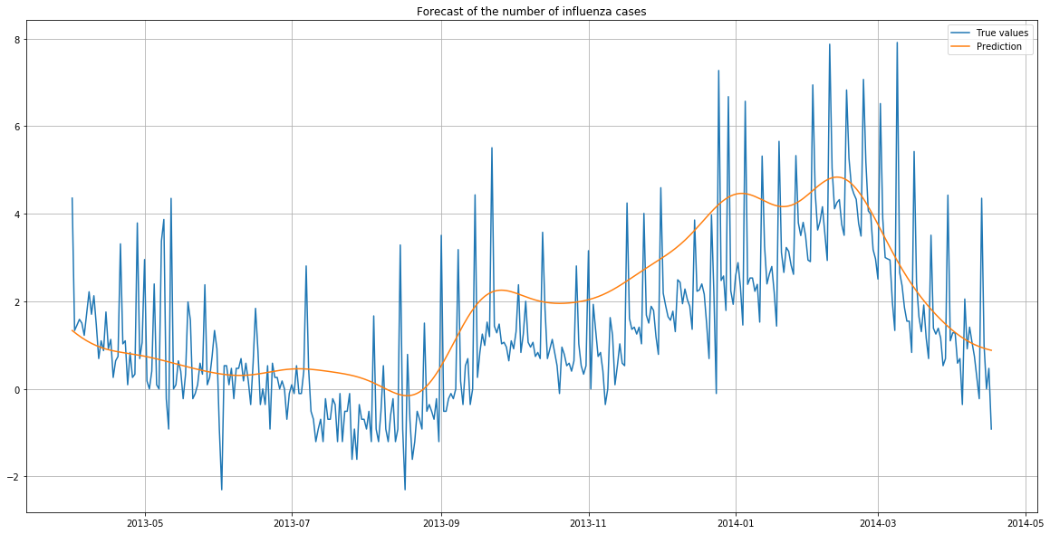
The predictions follow the same trend as the true values.
However, the predictions are higher than the reality. There were likely to be more flu cases overall in the training years (in particular in 2013 as we have seen before) than in the year of predictions.
We compute the mean squared error and the residues:
r_quad = sum((y_test - y_pred)**2)/len(y_test) #mean_squared_error(y_test, y_pred)
residus = y_test - y_pred
print("Mean squared error: {:.3f}".format(r_quad))
plt.figure(figsize=(20,10))
plt.plot(df_test["period"], residus)
plt.grid()
plt.title("Residues of the flu prediction")
plt.show()
Mean squared error: 1.869
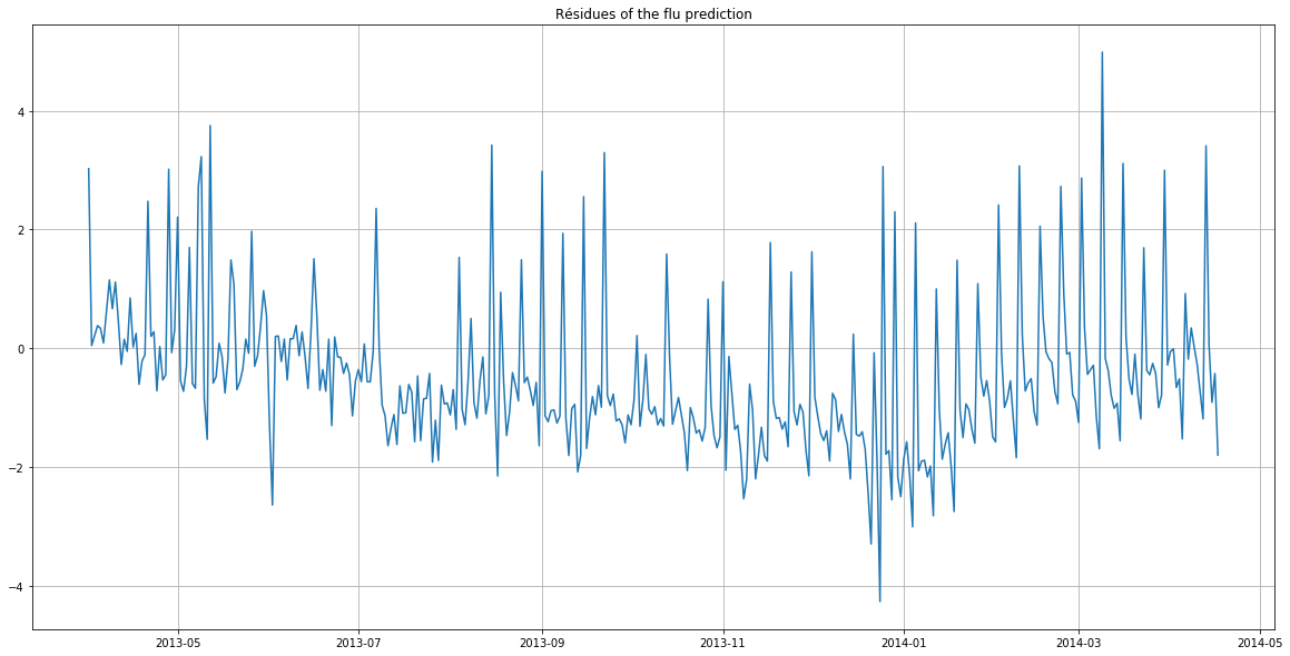
The residues highlight that the deviations from the predictions were the largest between October and February (greatest deviation from the x-axis).
We will compute the mean squared error for multiple n_harm parameter, in order to find the better one:
r_quads = []

for n_harm in range(1,30):
    df = df_initial.copy()
    for k in range(1, n_harm+1):
        df["cos_" + str(k)] = np.cos(df.index*k*2*np.pi/365)
    for k in range(1, n_harm+1):
        df["sin_" + str(k)] = np.sin(df.index*k*2*np.pi/365)

    df_train = df[(df["period"] >= "2009-07-01") & (df["period"] <= "2013-03-31")]
    df_test = df[(df["period"] >= "2013-04-01") & (df["period"] <= "2014-04-17")]

    X_train = df_train.drop(["period", "IAS_brut"], axis=1)
    y_train = df_train["IAS_brut"]
    X_test = df_test.drop(["period", "IAS_brut"], axis=1)
    y_test = df_test["IAS_brut"]

    lr = LinearRegression()
    lr = lr.fit(X_train, y_train)
    y_pred = lr.predict(X_test)

    r_quads.append(sum((y_test - y_pred)**2)/len(y_test)) #mse
plt.figure(figsize=(20,5))
plt.title("Mean squared error of the prediction according to the number of harmonics")
plt.plot(range(1,30), r_quads)
plt.xticks(range(1,30))
plt.grid()
plt.show()

The best (lowest) mean squared error is obtained with 11 harmonics.
You can see the complete code and explanations on the associated GitHub repository.
